AmazonClone
Abhishek Kumar | Amazon Clone (HOMEPAGE) | Geekster FS-14 Batch
Techstack used
Important tags used
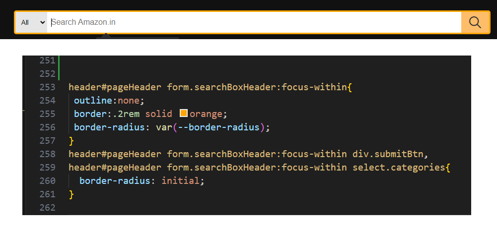
1. focus-within
form:focus-within{
	// to change form border color whenever form is in focus
}
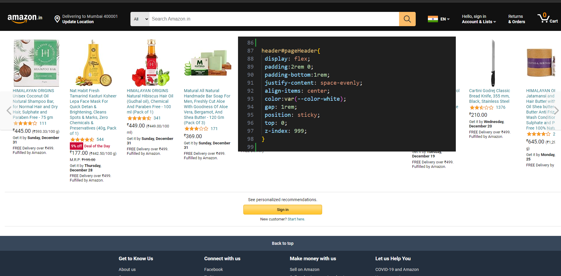
2. sticky position
header{
	position:sticky;
	z-index:999;
}
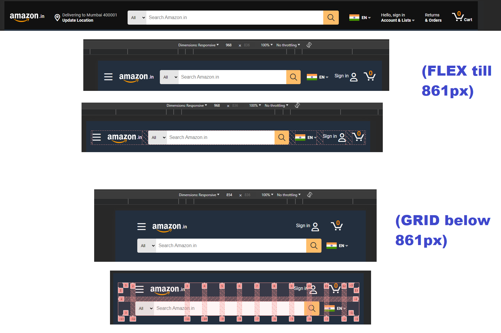
3. grid layout provides flexibilty
*grid-layout* for *header* when *screen-max-width* reaches 860px, before that **flex** was used
4. using link rel=icon to import favicon
<link rel="icon" href="../Assests/Common/Images/pageHeaderAndFooter/favicon.ico">
5. 404 page
404.html
6. Redirect to homepage after 2 seconds of page load
<meta http-equiv="refresh" content="2;url=/AmazonClone/homepage/index.html">
7. taking fresh offline Snapshot of dynamics website then start working on it
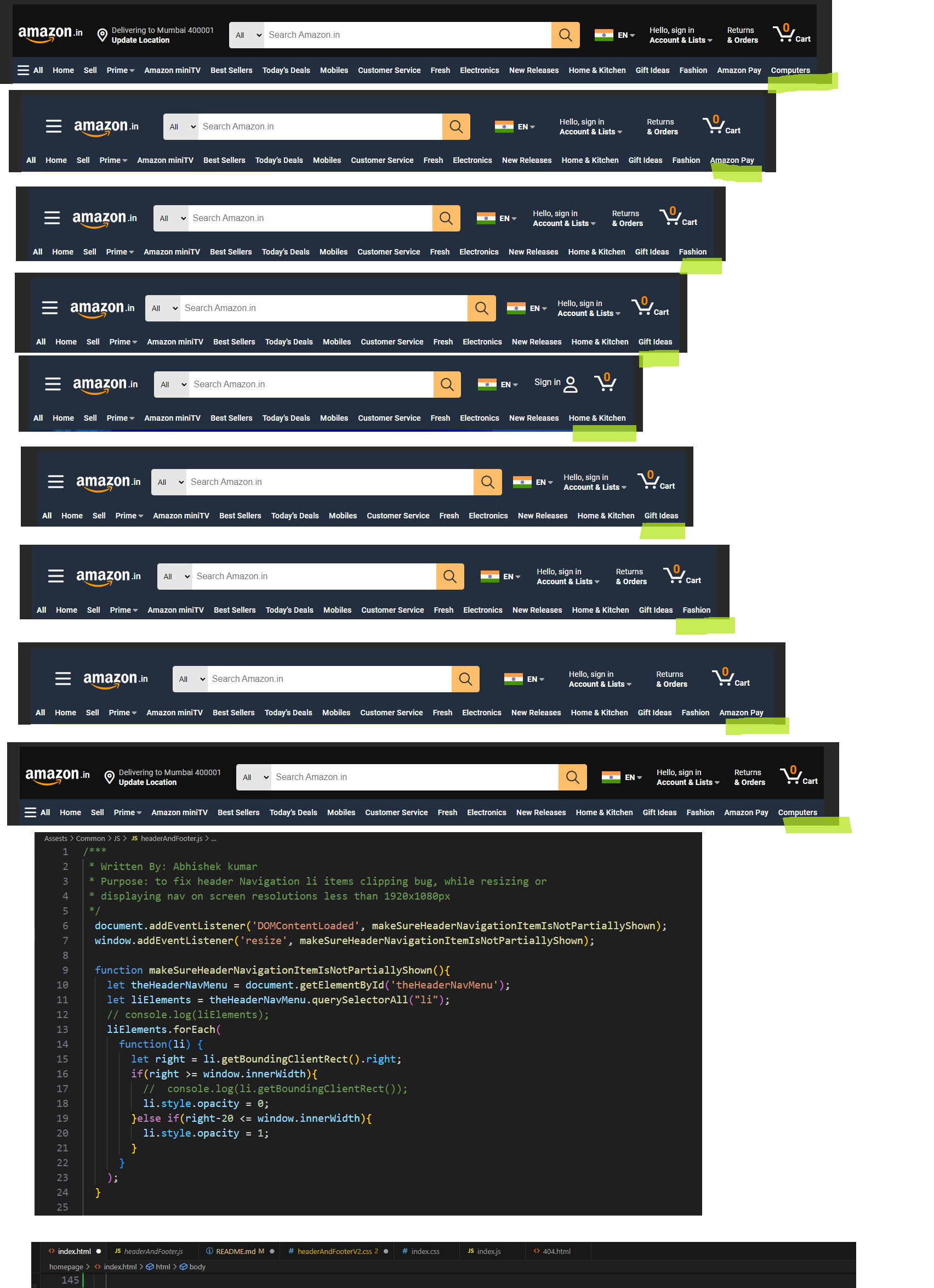
8. Solution for Header Primary Navigation clipping issue while resizing window
let right = li.getBoundingClientRect().right;
window.innerWidth
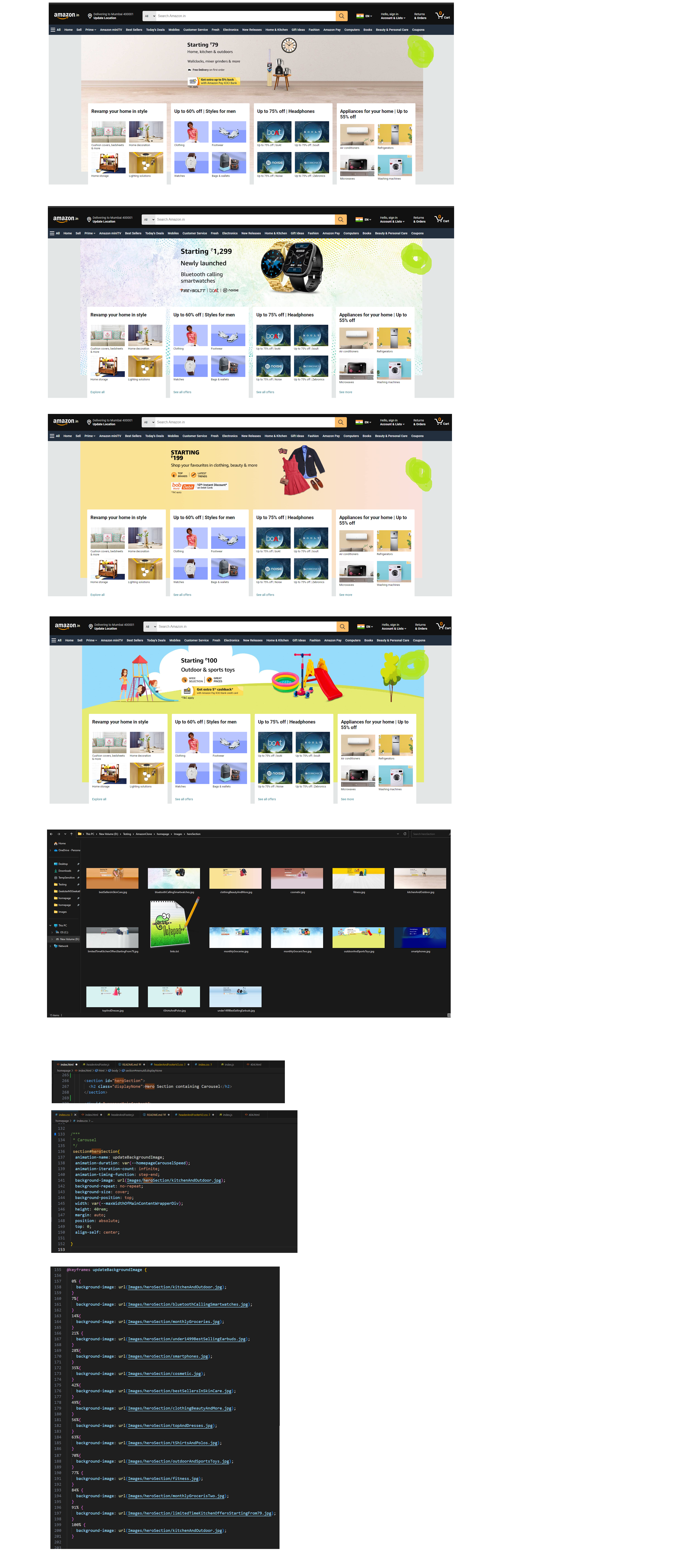
9. Animation keyframes were used for creating Carousel
main div#wrapperMainContent{
	background-repeat: no-repeat;
	background-size: contain;
	animation-name: updateBackgroundImage;
	animation-duration: var(--homepageCarouselSpeed);
	animation-iteration-count: infinite;
	animation-timing-function: step-end;
	background-image: url(Images/heroSection/kitchenAndOutdoor.jpg);
}
@keyframes updateBackgroundImage {
	0% {
		background-image: url(Images/heroSection/kitchenAndOutdoor.jpg);
	}
	9%{
		background-image: url(Images/heroSection/tShirtsAndPolos.jpg);
	}

	/*up to*/

	90%{
		background-image: url(Images/heroSection/fitness.jpg);
	}
	100% {
		background-image: url(Images/heroSection/kitchenAndOutdoor.jpg);
	}
}
10. for transition from one image to another this *step-end animation timing function works better for the carousel
animation-timing-function: step-end;
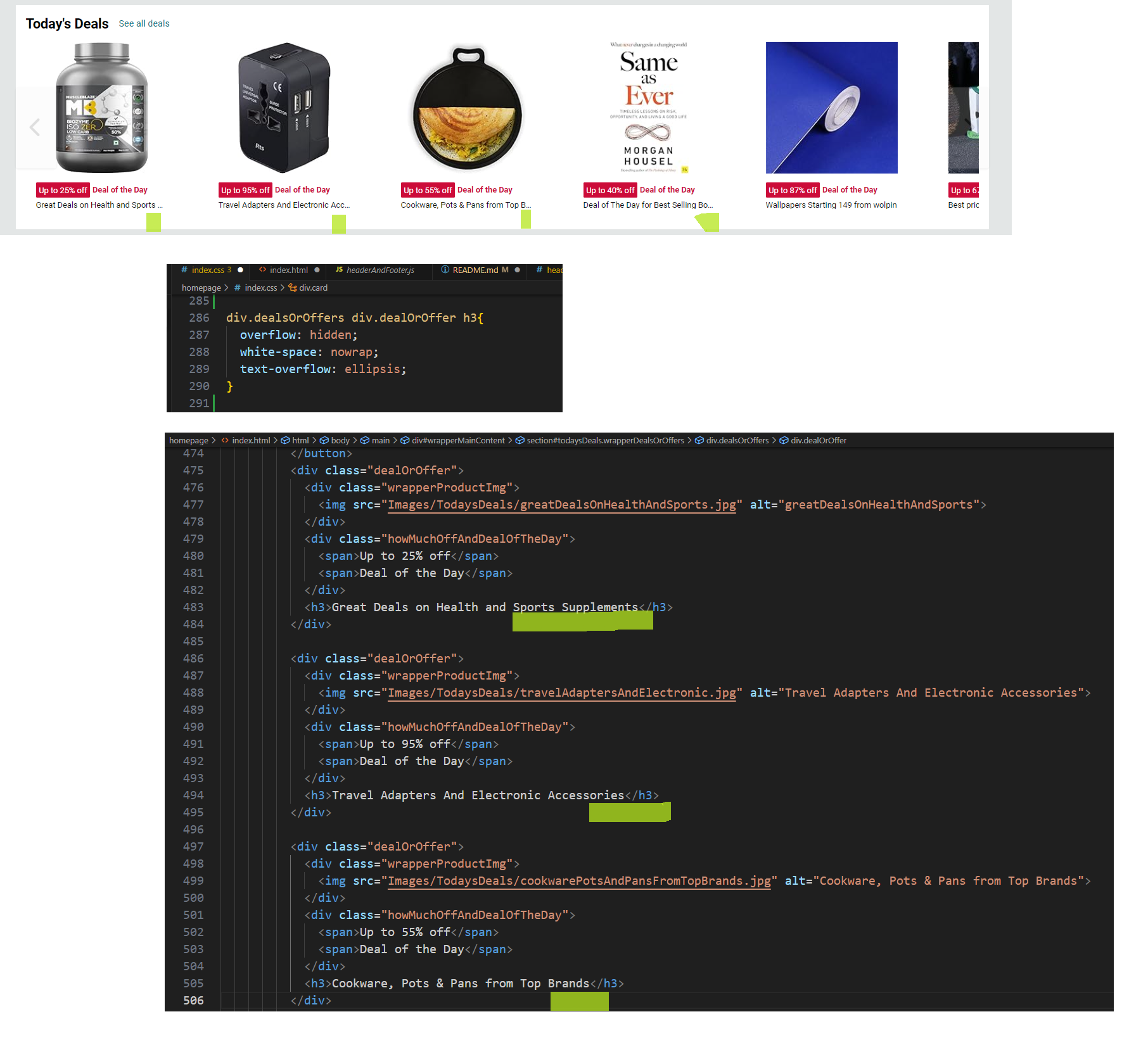
11. this is how to added three dots(ellipsis) for long long heading inside card
div.dealsOrOffers div.dealOrOffer h3{
	overflow: hidden;
	white-space: nowrap;
	text-overflow: ellipsis;
}
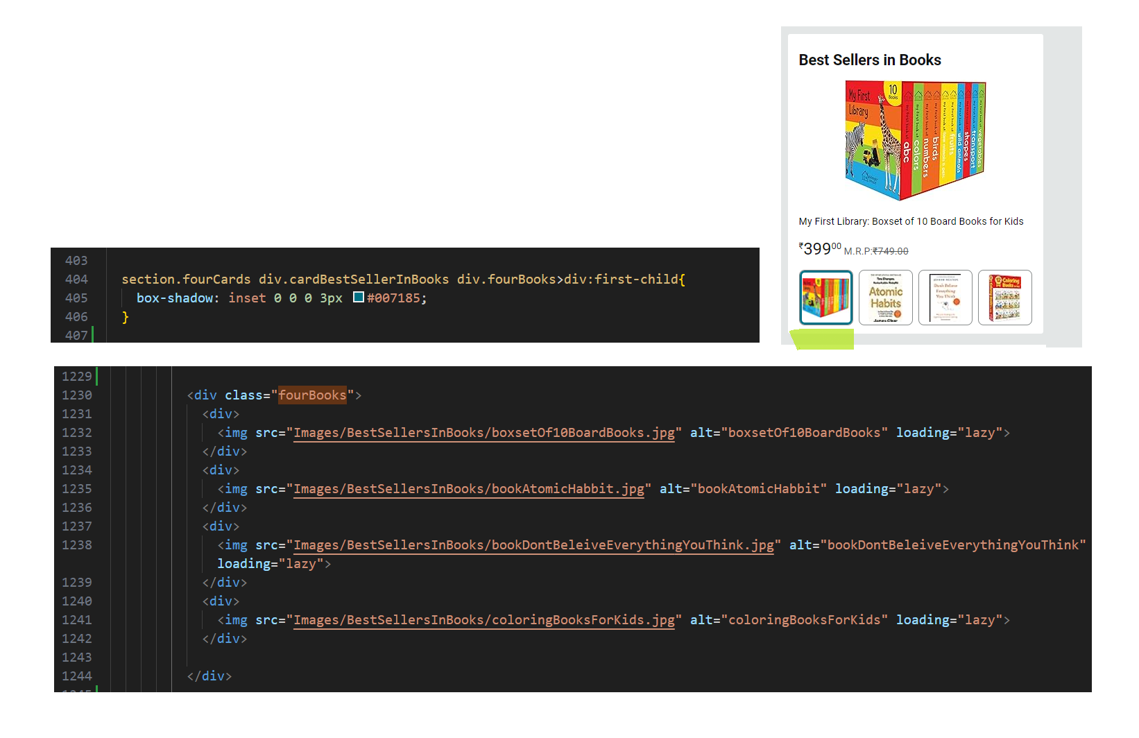
12. Box shadow inset can be used to highlight current item,
box-shadow: inset 0 0 0 3px #007185;
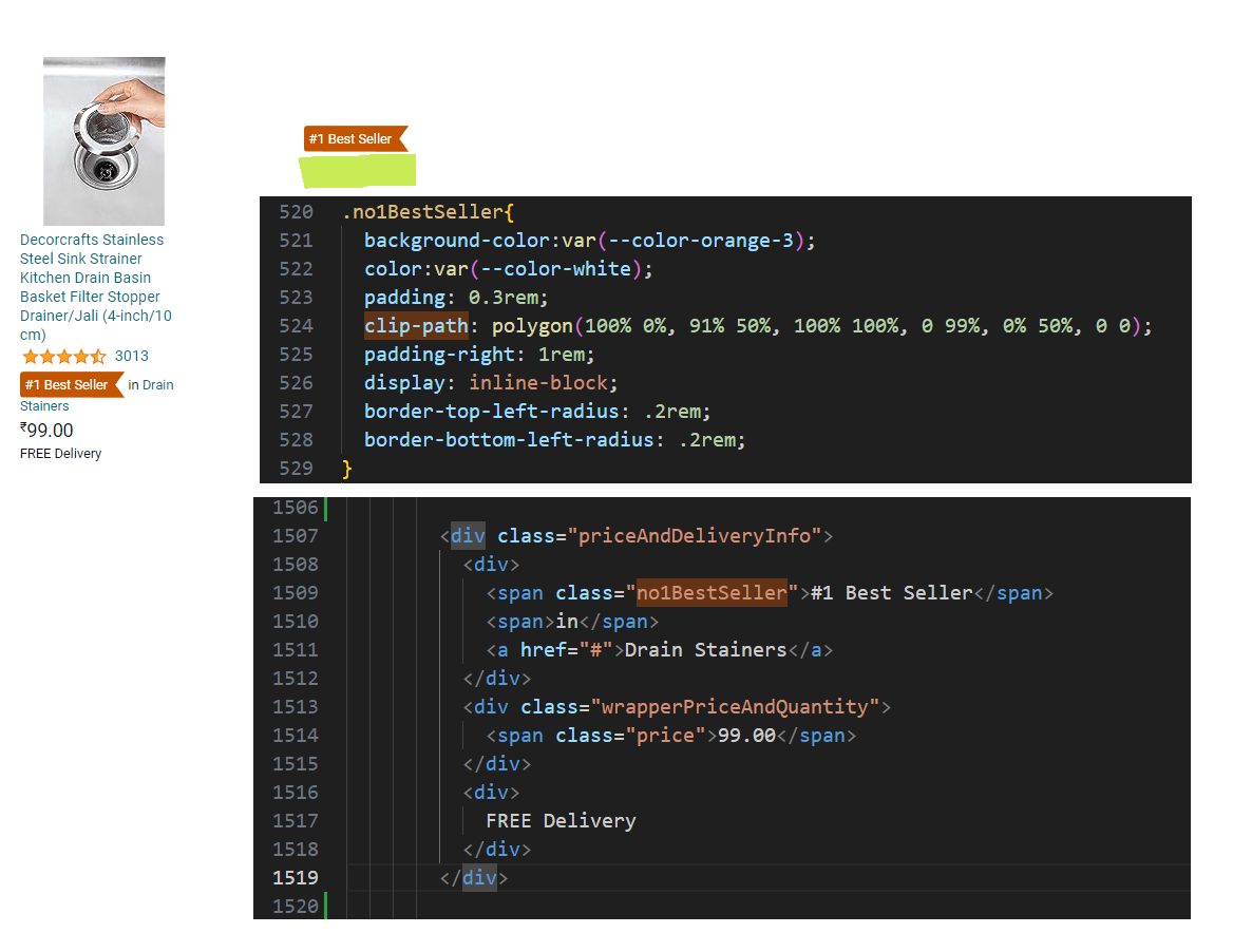
13. Used Clippy to generate clippath for the bestSeller polygon inside recommendations (Inspired by your browsing history)
clip-path: polygon(100% 0%, 91% 50%, 100% 100%, 0 99%, 0% 50%, 0 0);
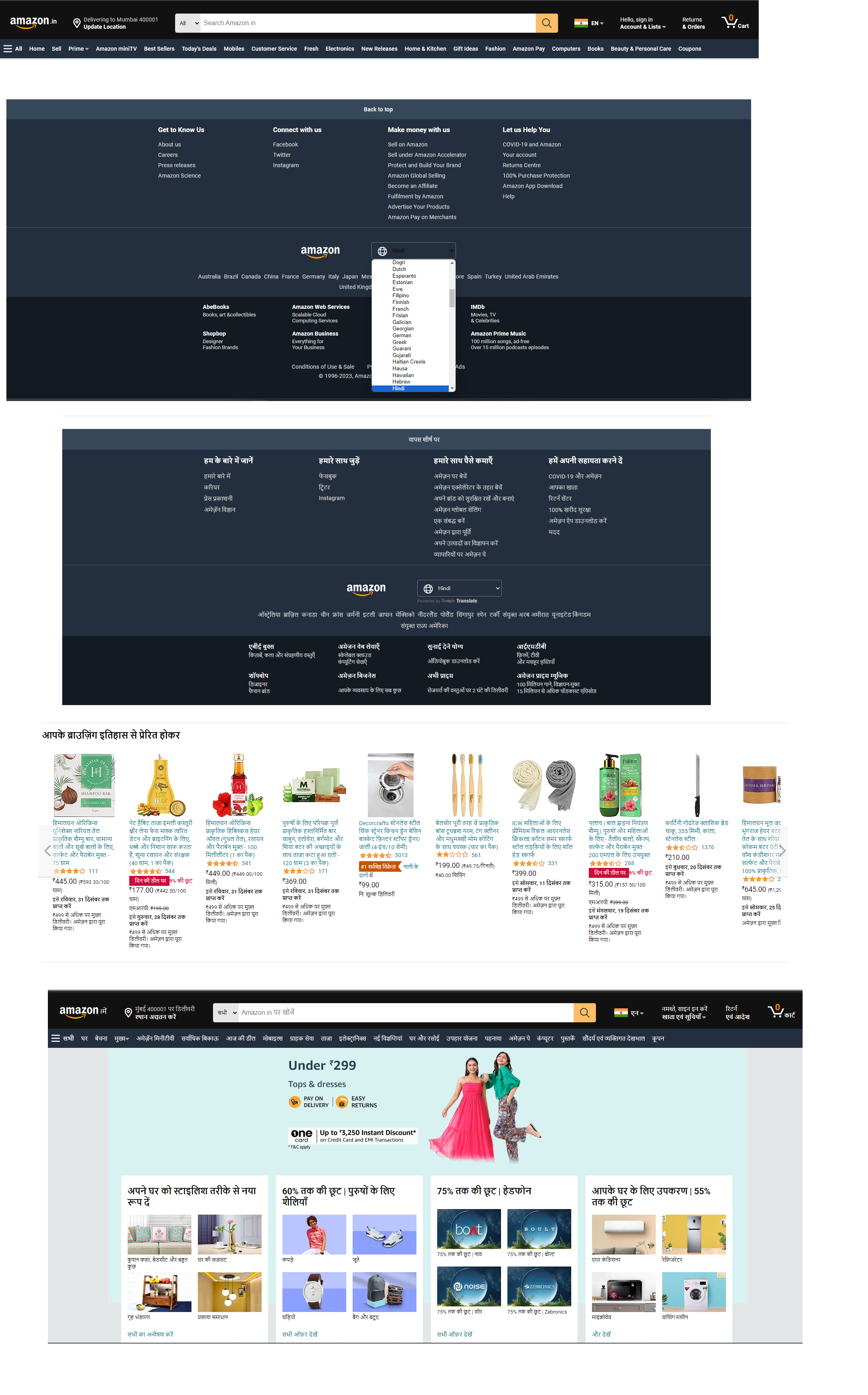
14. website language translation feature was added using google translate
<div id="google_translate_element"></div>
<!-- Google Translate -->
	<script type="text/javascript" src="//translate.google.com/translate_a/element.js?cb=googleTranslateElementInit"></script>
	<script type="text/javascript">
		function googleTranslateElementInit() {
			new google.translate.TranslateElement({pageLanguage: 'en'}, 'google_translate_element');
		}
	</script>
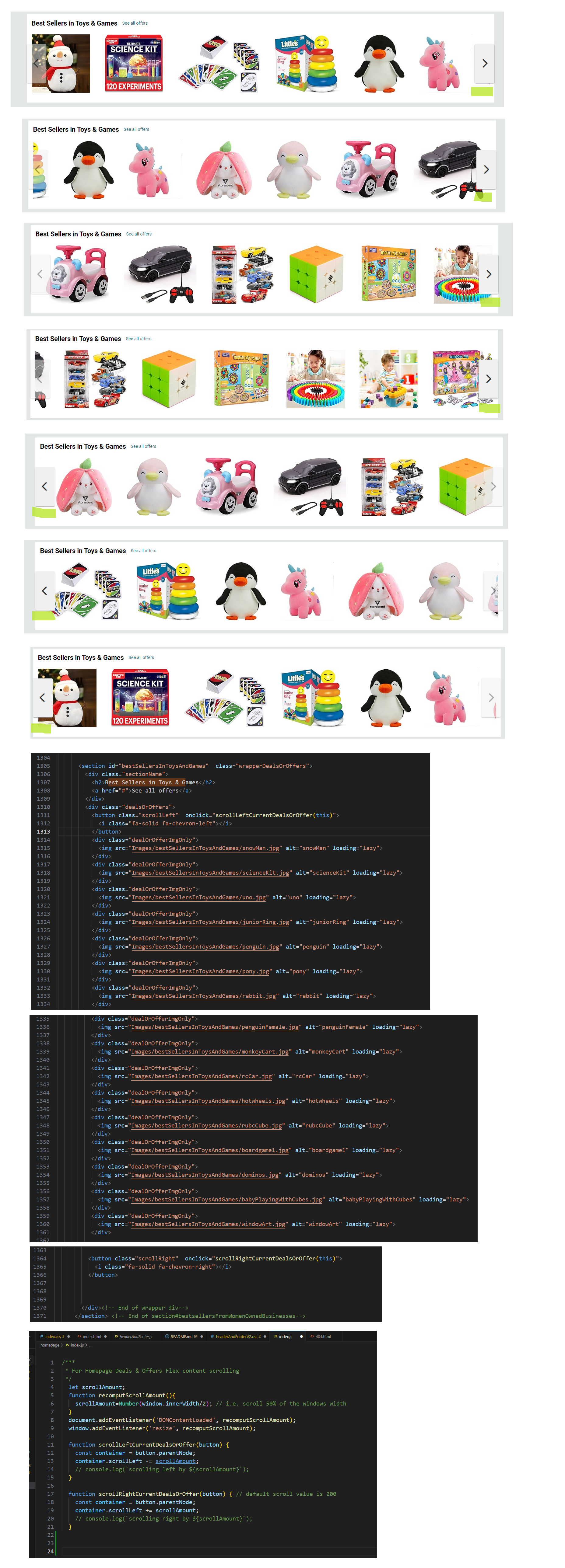
15. I learnt new property (container.scrollLeft) of javascript, using it i scrolled left and right the overflow content of container(flex)
container.scrollLeft += 200 //to scroll Right
container.scrollLeft += 200 // to scroll left
16. :active psedo class can be used to deal with touch devices like tablet and smartphones
div.dealsOrOffers:active button.scrollLeft,
div.dealsOrOffers:active button.scrollRight{
	opacity: .5;
}
My Learnings
- there is
:focus-withinproperty which get triggers whenver user is typing something on the input field - using
position:sticky & z-indexcss rule i can make the page header section appear on top of webpage even when scrolling - Grid layout can be used to position multiples items in random order as desired, used it inside header section when the responsive design screen max-width reached to 860px, there were 6 items, and needed to be arranged in particluar order without modifying the html structure.
- how to link favicon to our website
- if i create
404.htmlinside root then this webpage will be accessed if any webpage is not found on our webpage - using
meta http-equiv="refresh"i can redirect user to homepage - how useful it is to create snapshot of webpage by just downloading it offline, so that every time new dynamic content didn’t affect workflow while designing webpage
getBoundingClientRect()gives me thecoordinates(x,y,bottom, right)of element witin the viewport, this way i get position of element within viewport, and if it outside viewport i can easily check bywindow.innerWidthand take measured accordingly, used this feature to handle clipping of header primary nav items.- css animations can be used to design carousel
- step-end timing funciton, animation stays at the initial state until the end, and then it instantly jumps to the final state. the default timing function was making some kind of blurry image transitions, keeping background of previous image over the next image, so this was fixed using step-end
- i was working on the deals and offers card and notice the h3 heading text is occupying more than 1 lines and resulting the increase int the parent size, i want to have parent consistent size, so clip the extra h3 text and show elipsis, i found
text-overflow: elipsis;useful; it works only when two other propertiesoverflow:hidden and white-space:nowrapis set to. - in card best seller books, there was collection of 10 books big image, and same image thumbnail was there below with 3 other books images, i need to highlight that thumbnail, so i found
box-shadow: inset helpful. - inside the amazon recommendations (inspired by your browsing history), there was recommendation who were best seller, and i used clippy to generate clipath for the polygon.
- although google has officially no long provide documentation for how to integrate the google translate with our websites, my mentor Jaiten sir, shared with me the w3school how to use Google Translate link and now i added google translate to our website to transte it to difference languages.
- there are lots of horizontal flex in homepage having horizontal scrollbar, they were showing products and offers, and in amazon.in there are two buttons to let them scroll left and right, to achieve that functionality i found following javascript property handful,
scrollLeft, if i add 200 to it, container inside content would move 200px right and vice versacontainer.scrollLeft += 200 - for desktop and laptops
:hoverworks good, but for touch devices like smartphones and tablets, the:active pseudo classworks good,:activemeans whenever user presses the mouse button or tap on screen
Credits
- Geekster
- Jaiten Sahu Sir (Mentor | Geekster Geekathon Project Module #3 | Amazon Clone)
- Akhil Sharma Sir (Educator | Geekster MERN Stack Bootcamp Module #3)
- Ankit Singh Sir (TA | Booster Session | Geekster MERN Stack Bootcamp Module #3)
Screenshots
01-focusWithInOnSearchBarToMakeOutlineForEntireForm.png
02-stickyPageHeader
03-gridLayoutProvidesFlexibility
04-LinkRelToImportFaviconIcon
![]()
05-404Page

08-SolutionForHeaderNavigationClippingProblem
09-animation-usingKeyframes
11-added-three-dots-ellipsis
12-boxShadowInsetForHighlightingCurrentItem
13-noOneBestSeller
14-googleTranslate
15-containerScrollLeft
